@inquirer/password
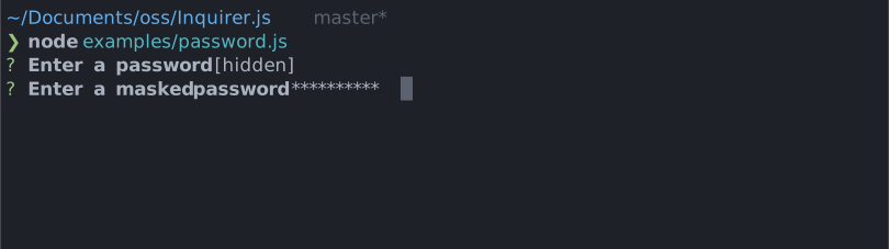
Interactive password input component for command line interfaces. Supports input validation and masked or transparent modes.
Installation
| yarn | pnpm |
|---|---|
|
|
| bun | deno |
|
|
| npm | |
| |
| Or | |
| yarn | pnpm |
|
|
| bun | deno |
|
|
| npm | |
|
On Deno, prompts detect the terminal's unicode and color support from the environment, so run your script with --allow-env.
Usage
import { password } from '@inquirer/prompts';
// Or
// import password from '@inquirer/password';

const answer = await password({ message: 'Enter your name' });Options
| Property | Type | Required | Description |
|---|---|---|---|
| message | string | yes | The question to ask |
| mask | boolean | string | no | Show a * mask over the input, use a custom mask character, or keep it transparent. |
| toggleMask | boolean | no | Allow the user to press ctrl+t to temporarily reveal the typed value. Defaults to true; set to false to disable both the shortcut and its help line. |
| validate | string => boolean | string | Promise<boolean | string> | no | On submit, validate the filtered answered content. When returning a string, it'll be used as the error message displayed to the user. Note: returning a rejected promise, we'll assume a code error happened and crash. |
| theme |
Theming
You can theme a prompt by passing a theme object option. The theme object only need to includes the keys you wish to modify, we'll fallback on the defaults for the rest.
type Theme = {
  prefix: string | { idle: string; done: string };
  spinner: {
    interval: number;
    frames: string[];
  };
  style: {
    answer: (text: string) => string;
    message: (text: string, status: 'idle' | 'done' | 'loading') => string;
    error: (text: string) =>
maskedText is the inline tip shown when mask is off and the value is hidden (default: [input is masked]).
theme.style.keysHelpTip
This function customizes the keyboard shortcut help displayed on the line below the prompt. It receives [['ctrl+t', 'toggle visibility']] while the value is hidden. Use it to change the formatting or localize the action, or return undefined to hide the help line entirely.
theme: {
  style: {
    keysHelpTip: (keys) =>
      keys.map(([key, action]) => `${key}: ${action}`).join(' | '),
  },
}License
Copyright (c) 2023 Simon Boudrias (twitter: @vaxilart)
Licensed under the MIT license.