Create a function that builds paths for tool log information. The returned function returns an object mapping virtual path names to actual path names, such as:
toolSpecificFiles - array of file names to generate, on top of the defaults (/, /systeminfo).
If toolName is 'doctor', this defaults to ['/traceevent', '/processstat'].
If toolName is 'bubbleprof', this defaults to ['/traceevent', '/stacktrace'].
checkForTranspiledCode(fileName)
A function that will check file contents for transpiled code. Check also includes a search for a source map comment.
💡 opts.data can be provided to place the JSON output of the analysis into its own script tag. When not provided, analysis data should be bundled in the scriptFile by the user.
Styles
Importable CSS to include when using the mainTemplate to be used in conjunction with the buildCss script to ensure it is bundled with tool-specific styling. This adds some global styles for the header and tray. The CSS is written using BEM to avoid specificity and has the following overrideable CSS variables:
CSS should be written using classes using BEM as a naming convention for better encapsulation and lower specificity.
Inside this repo, all classes are vendor-prfixed with .nc- to avoid class name collision with third party or tool specific styles. For tool-based styling, all styles should follow the same conventions with prefixes for the tools as follows:
  path(sourceDir, exportDir)
  // and
  file(filePath, exportDir)
The supported file extensions are:
pngjpegjpg and gif
Use example:
  // in your npm script
  const buildImg = require('@clinic/clinic-common/scripts/build-images')
  buildImg.file('my/amazing/image.jpg', 'visualizer/assets/images')

  // in your .js file you first import the image
  const myImage = require('visualizer/assets/images/image.js')

  // and then you use it
  `<img src=${myImage} ... />
Components
A set of base components and helpers. All the components styles are @imported in style.css and can be imported as follows:
The standardised button to tools which activates the Walkthroughs
  // walkthroughButton(steps, onProgress, [label])
  const hdtw = walkthroughButton(wtSteps, index => {
    this.pushHistory()
  })

  // hdtw.WtPlayer -> the embeded walkthrough player
  // hdtw.button -> the button instance to append to the DOM

  // label defaults to 'How does this work'
helpers
A set of useful functions. Currently contains:
toHtml(data) Data can be a string, a function or an HTMLElement. The output is an HTMLElement
  const myHtml = helpers.toHtml(`<span>${greetings}</span>`)
  // or
  const myHtml = helpers.toHtml(getGreetings)
Spinner
To add the loading spinner to your app please import @clinic/clinic-common/spinner in your main.js and the style.css file to your style.css
This will display the loading spinner while the page gets loaded.
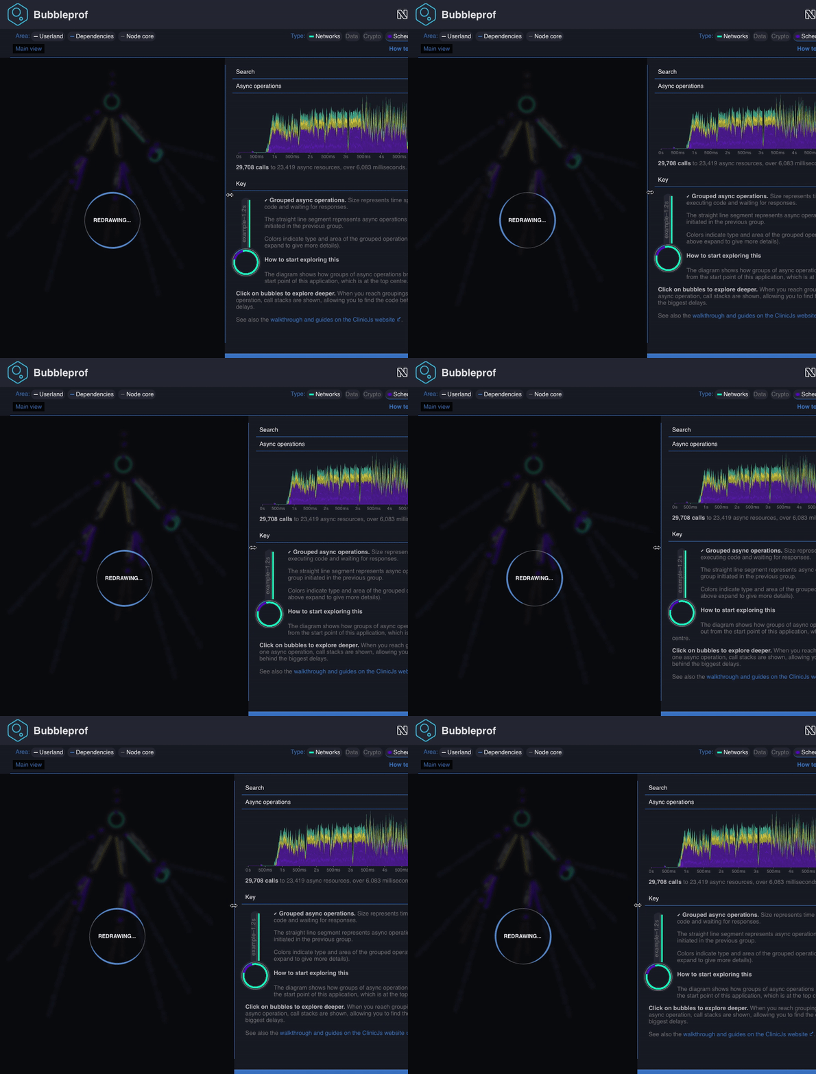
If you need to show the spinner later on, maybe while the app is busy doing some calculation, you can programmatically switch the spinner on and off as shown in the following example:
const spinner = require('@clinic/clinic-common/spinner')...const redrawSpinner = spinner.attachTo(document.querySelector('#myHtmlContainerNode'))redrawSpinner.show('Melting the North pole down...')// when finishedredrawSpinner.hide()
The spinner rotating border is white by default, you can customise it by setting the css var --spinner-border-color in your css:
html {/* this will set the colour for the page-loading spinner*/ --spinner-border-color: --my-fancy-primary-color;}#myHtmlContainerNode { /* this will set the colour for the in-page spinner*/ /* this is optional and inherits from `html` if not defined*/ --spinner-border-color: --my-fancy-secondary-color;}
Attaching the spinner to an element creates a new instance of spinner that can be used later on the switch the spinner on/off. When the spinner is displayed, the element to which the spinner is attached gets blurred and overlaid by a dark box.