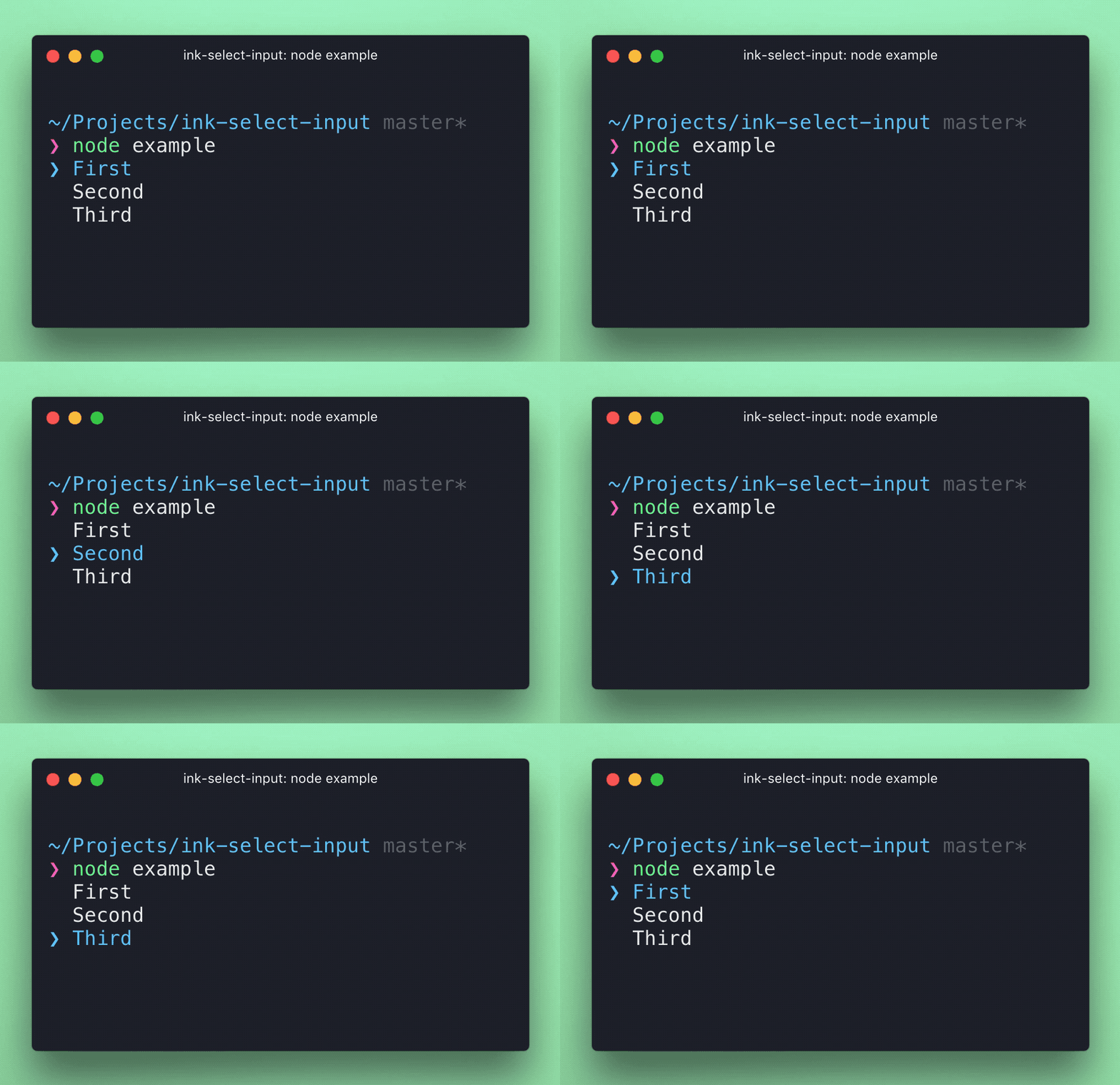
The user can navigate using arrow up/down keys or the jk keys, then press return to select. Alternatively, press the number key corresponding to an option to select it instantly.
Props
items
Type: array
Default: []
Items to display in a list. Each item must be an object and have label and value props, it may also optionally have a key prop.
If no key prop is provided, value will be used as the item key.
isFocused
Type: boolean
Default: true
Listen to user's input. Useful in case there are multiple input components at the same time and input must be "routed" to a specific component.
initialIndex
Type: number
Default: 0
Index of initially-selected item in items array.
limit
Type: number
Number of items to display.
indicatorComponent
Type: Component
Custom component to override the default indicator component.
itemComponent
Type: Component
Custom component to override the default item component.
onSelect
Type: function
Function to call when user selects an item. Item object is passed to that function as an argument.
onHighlight
Type: function
Function to call when user highlights an item. Item object is passed to that function as an argument.