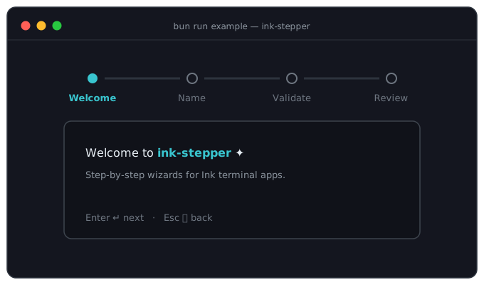
Step-by-step wizard component for Ink terminal applications.
Plain-text preview
━━━━━ ✓ ━━━━━━━━━━ ✓ ━━━━━━━━━━●━━━━━━━━━━○━━━━━ Theme Directory Review Done┌─────────────────────────────────────────────────┐│ ││ Review your selections: ││ ││ Theme: Dark ││ Directory: ~/projects ││ ││ Press Enter to continue, Escape to go back ││ │└─────────────────────────────────────────────────┘
Called before leaving a step (return false to cancel; no return value needed for side-effect-only handlers)
onError
(error: unknown) => void
-
Called when an async canProceed or onExitStep throws or rejects. Navigation is blocked either way; without this prop the error is logged via console.error
step
number
-
Controlled step index (zero-based)
initialStep
number
0
Starting step index for uncontrolled mode. Ignored when step is provided
keyboardNav
boolean
true
Enable Enter/Escape navigation
showProgress
boolean
true
Show the progress bar
renderProgress
(ctx: ProgressContext) => ReactNode
-
Custom progress bar renderer
markers
StepperMarkers
-
Custom progress bar markers
pulse
boolean
false
Pulse the current marker's brightness (bright → normal → dim), spinner-style. Ignored with renderProgress
<Step>
Marker component for defining individual steps.
Prop
Type
Default
Description
name
string
required
Display name in progress bar
canProceed
boolean | (() => boolean | Promise<boolean>)
true
Whether navigation to next step is allowed (supports async)
children
ReactNode | (ctx: StepContext) => ReactNode
required
Step content
StepContext
Context passed to step content when using the render function pattern:
interface StepContext { goNext: () => void; // Navigate to next step (respects canProceed) goBack: () => void; // Navigate to previous step goTo: (step: number) => void; // Jump to specific step (zero-based, skips canProceed) cancel: () => void; // Cancel the wizard currentStep: number; // Current step index (zero-based) totalSteps: number; // Total number of steps isFirst: boolean; // Whether this is the first step isLast: boolean; // Whether this is the last step isValidating: boolean; // Whether async validation is in progress}
goTo clamps the index to the valid range and fires the full lifecycle
(onExitStep → onStepChange → onEnterStep), so returning false from onExitStep cancels the
jump. Unlike goNext, it deliberately skips the current step's canProceed check - it is a raw jump.
goNext, goBack and goTo are all no-ops while async validation is in flight or while navigation is
disabled (see Input Coordination).
ProgressContext
Context passed to custom progress bar renderer:
interface ProgressContext { currentStep: number; steps: Array<{ id: string; // Stable unique id - safe to use as a React key name: string; completed: boolean; current: boolean; }>;}
Keyboard Navigation
By default, keyboard navigation is enabled:
Enter - Advance to next step (if canProceed is true)
Escape - Go back (or cancel if on first step)
Disable with keyboardNav={false}.
Keys are ignored while async validation is running or while navigation has been disabled via
useStepperInput.
The isValidating flag in StepContext is true while async validation is running, allowing you to show loading states. Navigation calls are ignored while it is true.
Errors
If an async canProceed or onExitStep throws or rejects, navigation is blocked and the error is
handed to the optional onError prop:
Without onError, the error is logged via console.error. Either way the rejection is caught, so it
never escapes as an unhandled rejection that would terminate the host process.
Lifecycle Hooks
onEnterStep / onExitStep
Execute logic when entering or leaving steps:
<Stepper onComplete={handleComplete} onEnterStep={(step) => { analytics.track(`entered_step_${step}`); }} onExitStep={async (step) => { // Save draft before leaving - no return value needed await saveDraft(step); }}> ...</Stepper>
onExitStep returns void | boolean | Promise<void | boolean>. Only an explicit false cancels
navigation - side-effect-only handlers can return nothing:
The lifecycle fires for goNext, goBack and goTo alike: onExitStep → onStepChange →
onEnterStep. It does not fire when the Stepper silently repairs the active index after steps are
added or removed elsewhere in the list - the user did not navigate, so no callback runs.
Input Coordination
When steps contain interactive inputs (TextInput, Select, etc.), use useStepperInput to prevent keyboard conflicts:
This prevents Enter from advancing the step while the user is typing.
Re-enable before navigating
goNext(), goBack() and goTo() are no-ops while navigation is disabled. If your submit handler
navigates, call enableNavigation()before the navigation call:
const { disableNavigation, enableNavigation } = useStepperInput();const handleSubmit = () => { enableNavigation(); // must come first goNext(); // silently does nothing if navigation is still disabled};
Getting this order wrong fails silently - the Enter key simply appears dead. See
examples/wizard.tsx (NameStep) for a working implementation.
In controlled mode the step prop wins: initialStep is ignored, and navigation calls report the new
index through onStepChange without moving the Stepper until you update step yourself.
Wrapped & Conditional Steps
Steps can be wrapped in custom components, fragments, or conditional logic:
Steps are ordered by their position in the element tree, not by when they mounted: a step that toggles
on after the initial render slots into its JSX position (Optional above lands between Wrapped and
Review, never at the end).
In uncontrolled mode the user stays on the same step across such changes - the active step is pinned
by identity, so inserting or removing a step elsewhere in the list does not move them. These repairs are
silent: onStepChange, onEnterStep and onExitStep do not fire for them. If the active step itself
is removed, the index is kept, so the step that slides into that position becomes active; it clamps to
the last remaining step only when the removed step was the last one.
In controlled mode the parent owns the index, so inserting a step before the current index changes which
step that index refers to. Update your own state if you want to keep the user in place.
Limitation: a Step must not be nested inside another Step. Wrapper components, fragments and
conditionals around a Step are all fine.
Custom Progress Bar
Custom Markers
Customize the progress bar markers without replacing the entire component:
Each entry carries a stable id - use it as the React key, since step names are not guaranteed unique.
Advanced: useStepperContext
For advanced use cases, access the full stepper context:
import { useInput } from "ink";import { useStepperContext } from "ink-stepper";function CustomStepContent() { const { stepContext, currentStepId } = useStepperContext(); useInput((input) => { if (input === "n") stepContext?.goNext(); }); if (!stepContext) return null; // null when no step is active return ( <Box> <Text>Step {stepContext.currentStep + 1}</Text> <Text dimColor>Press "n" for next</Text> </Box> );}
The hook throws if called outside a <Stepper>.
Exports
// Componentsexport { Stepper, Step } from "ink-stepper";// Hooksexport { useStepperContext, useStepperInput } from "ink-stepper";// Typesexport type { StepperProps, StepProps, StepContext, ProgressContext, StepperMarkers, StepperContextValue, RegisteredStep, UseStepperInputReturn,} from "ink-stepper";
Example
A runnable wizard that exercises the whole API lives in examples/wizard.tsx:
bun run example# start on a specific stepINITIAL_STEP=2 bun run example
It covers plain and render-function steps, a text input coordinated through useStepperInput, async
canProceed with isValidating and a throwing validator routed to onError, a conditional step that
appears in tree position, and a goTo jump - with every lifecycle callback printed to an event log.