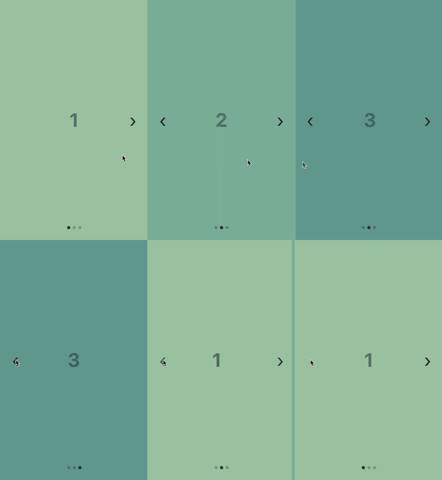
Customizable, lightweight React Native carousel component with accessibility support.
Pinar is a lightweight and customizable React Native carousel component that works well when creating simple image sliders or app onboarding flows.
If you need more advanced things like animations, lazy loading of images, or parallax, then please consider using a library like react-native-reanimated-carousel.
You can then call the method from outside the carousel:
<Button title="scroll to next page" onPress={() => { this.carousel.scrollToNext(); }}/>
Method
Arguments
Type
Description
scrollToPrev
None
function
Scroll to the previous page.
scrollToNext
None
function
Scroll to the next page.
scrollBy
{index: number, animated: boolean}
function
Scroll by a number of pages. The number can be negative to scroll backwards.
scrollToIndex
{index: number, animated: boolean}
function
Scroll to a page index (0 based).
startAutoplay
None
Custom styling properties
Use these properties to customize how the carousel is styled.
Set the mergeStyles property to true if you want to merge your custom styles with the default ones instead of having define all the needed styles. You can also import { defaulStyles } from "pinar" to get access to the default styles and use them as defaults.
Use these properties to provide your own functions render custom elements instead of the default ones. Have a look at the custom rendering component for an example.
Property
Function parameters
Type
Description
Pagination dots
renderDots
({ index, total, context }) => void
function
Use to render custom pagination dots.
renderDot
({ index }) => void
function
Use to render custom dot (not active).
renderActiveDot
({ index }) => void
function
Use to render custom active dot.
Prev/Next buttons
Properties of <ScrollView />
These properties are exposed from <ScrollView />. You can provide your own properties if you want to customize it.
Property
Default
Type
Description
automaticallyAdjustContentInsets
false
bool
Controls whether iOS should automatically adjust the content inset for scroll views that are placed behind a navigation bar or tab bar/ toolbar.
bounces
false
bool
If true, the scroll view bounces when it reaches the end of the content if the content is larger then the scroll view along the axis of the scroll direction. If false, it disables all bouncing even if the alwaysBounce* props are true.
contentContainerStyle
undefined
StyleProp<ViewStyle>
These styles will be applied to the scroll view content container which wraps all of the child views.
onMomentumScrollEnd
undefined
function
Called when the momentum scroll ends (scroll which occurs as the ScrollView glides to a stop).
If you want help out with the development of this library, bug reports and fixes are very welcome. If you are thinking about a new feature, please open a feature request issue first to verify that implementing it makes sense.
How to develop locally
First make sure that you have Node.js, Yarn and React Native installed. It is also a good idea to have Xcode and/or Android Studio installed to be able to run the iOS simulators / Android emulators.
If you choose to install emulators or simulators, you can use the example app to test your changes in a React Native app.
Automated tests
When making changes to the code, please add a unit test or a functional test to verify that the code is working. The test runner that the project uses is Jest, Enzyme is used to test React Components, and Detox is used to run functional tests against the project's example app. The command to run unit tests is yarn test and the command to run functional tests is yarn functional.
Before you submit the code for a Pull Request, make sure that you run yarn test, yarn tsc, and yarn lint to verify that unit tests pass and both the Typescript type checking and ESLint linting are not printing any errors.
Special thanks
Special thanks for these libraries for providing inspiration for code and other things:
Delay between autoplay page changes (in milliseconds).
width
-
number
If not specified, the default fullscreen mode is enabled using flex: 1.
height
-
number
If not specified, the default fullscreen mode is enabled using flex: 1.
accessibility
true
boolean
Set to false to disable accessibility features (not recommended).
accessibilityLabelPrev
Previous
string
Accessibility label for the prev button.
accessibilityLabelNext
Next
string
Accessibility label for the next button.
mergeStyles
false
boolean
Set to true to merge your custom styles with the default styles.
function
Starts carousel autoplay.
stopAutoplay
None
function
Stops carousel autoplay.
controlsContainerStyle
{...}
StyleProp<ViewStyle>
Custom style for the prev/next buttons container.
controlsButtonStyle
{...}
StyleProp<ViewStyle>
Custom style for the prev/next button.
controlsTextStyle
{...}
StyleProp<TextStyle>
Custom style for the prev/next button text.
Pagination dots
dotsContainerStyle
{...}
StyleProp<ViewStyle>
Custom style for the pagination dots container.
dotStyle
{...}
StyleProp<ViewStyle>
Custom style for a single pagination dot.
activeDotStyle
{...}
StyleProp<ViewStyle>
Custom style for the active pagination dot.
renderControls
({ scrollToPrev, scrollToNext }) => void
function
Use to render custom prev/next controls.
renderPrev
({ scrollToPrev }) => void
function
Use to render custom prev control.
renderNext
({ scrollToNext }) => void
function
Use to render custom next control.
onScroll
undefined
function
Fires at most once per frame during scrolling. The frequency of the events can be controlled using the scrollEventThrottle prop.
pagingEnabled
true
bool
When true, the scroll view stops on multiples of the scroll view's size when scrolling. This can be used for horizontal pagination.
removeClippedSubviews
true
bool
When true, offscreen child views (whose overflow value is hidden) are removed from their native backing superview when offscreen. This can improve scrolling performance on long lists.
scrollEnabled
true
bool
When false, the view cannot be scrolled via touch interaction.
scrollEventThrottle
16
number
This controls how often the scroll event will be fired while scrolling (as a time interval in ms). A lower number yields better accuracy for code that is tracking the scroll position, but can lead to scroll performance problems due to the volume of information being send over the bridge. You will not notice a difference between values set between 1-16 as the JS run loop is synced to the screen refresh rate. If you do not need precise scroll position tracking, set this value higher to limit the information being sent across the bridge.
scrollsToTop
false
bool
When true, the scroll view scrolls to top when the status bar is tapped.
showsHorizontalScrollIndicator
false
bool
When true, shows a horizontal scroll indicator. The default value is true.
showsVerticalScrollIndicator
false
bool
When true, shows a vertical scroll indicator. The default value is true.