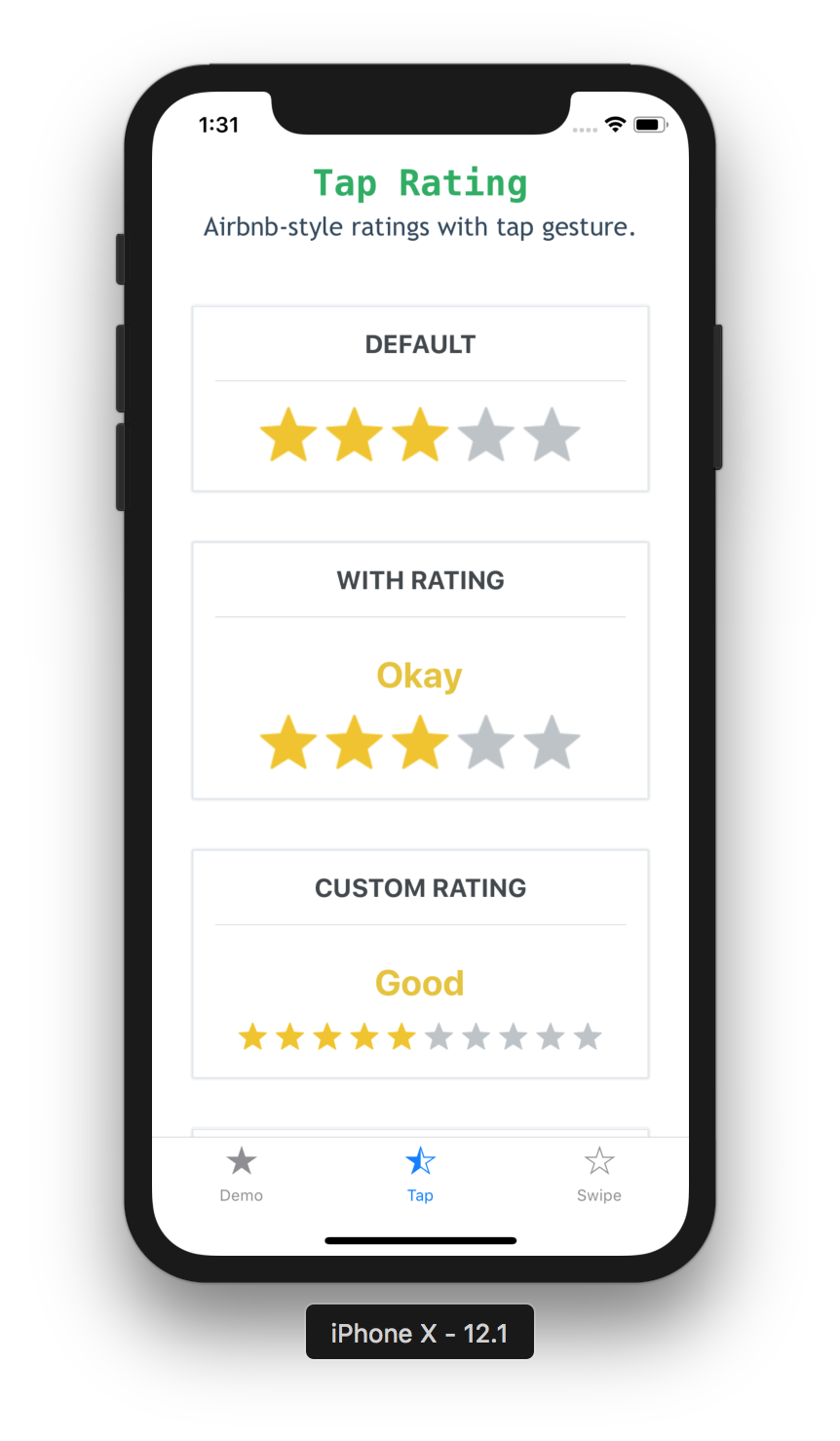
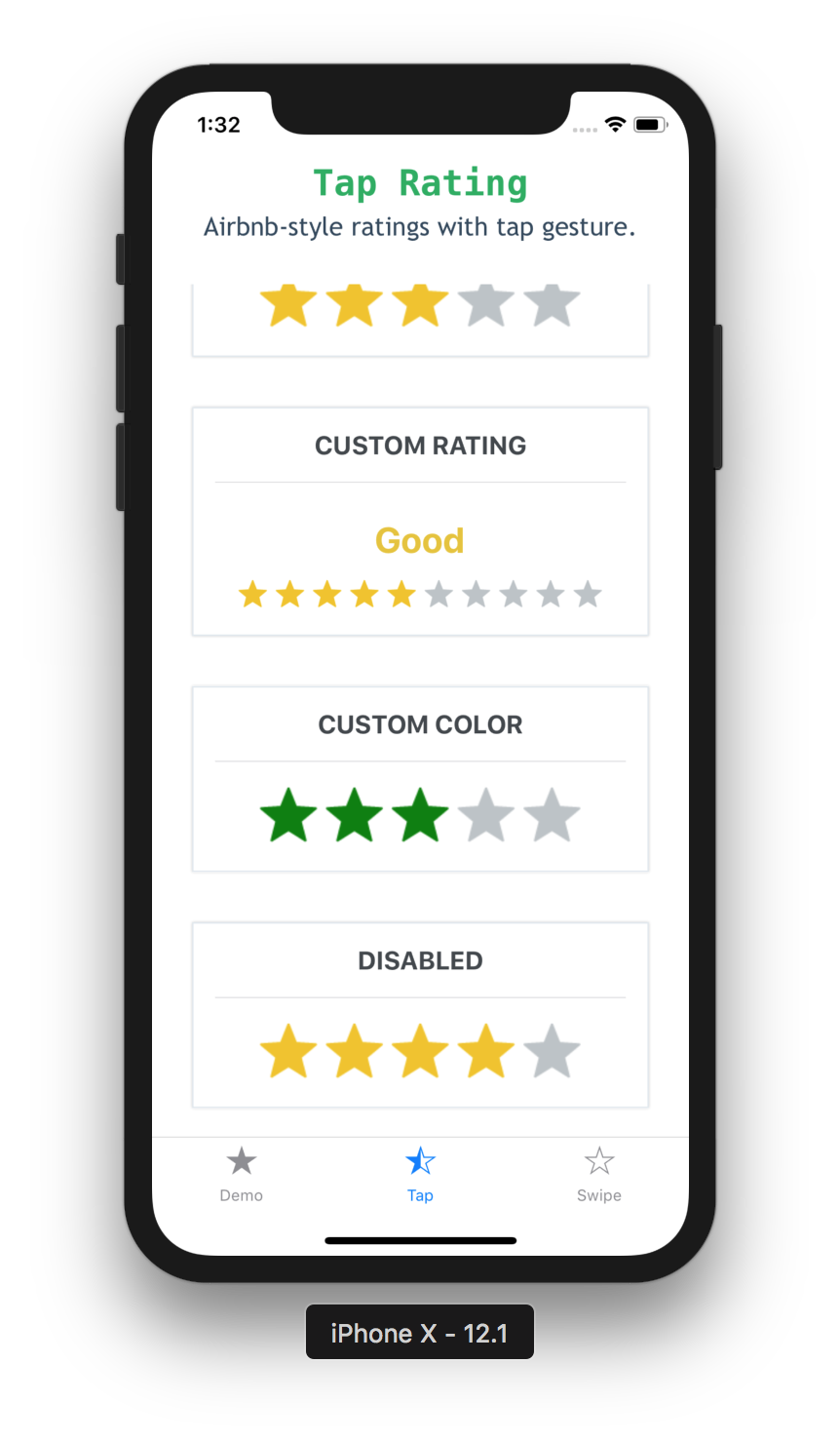
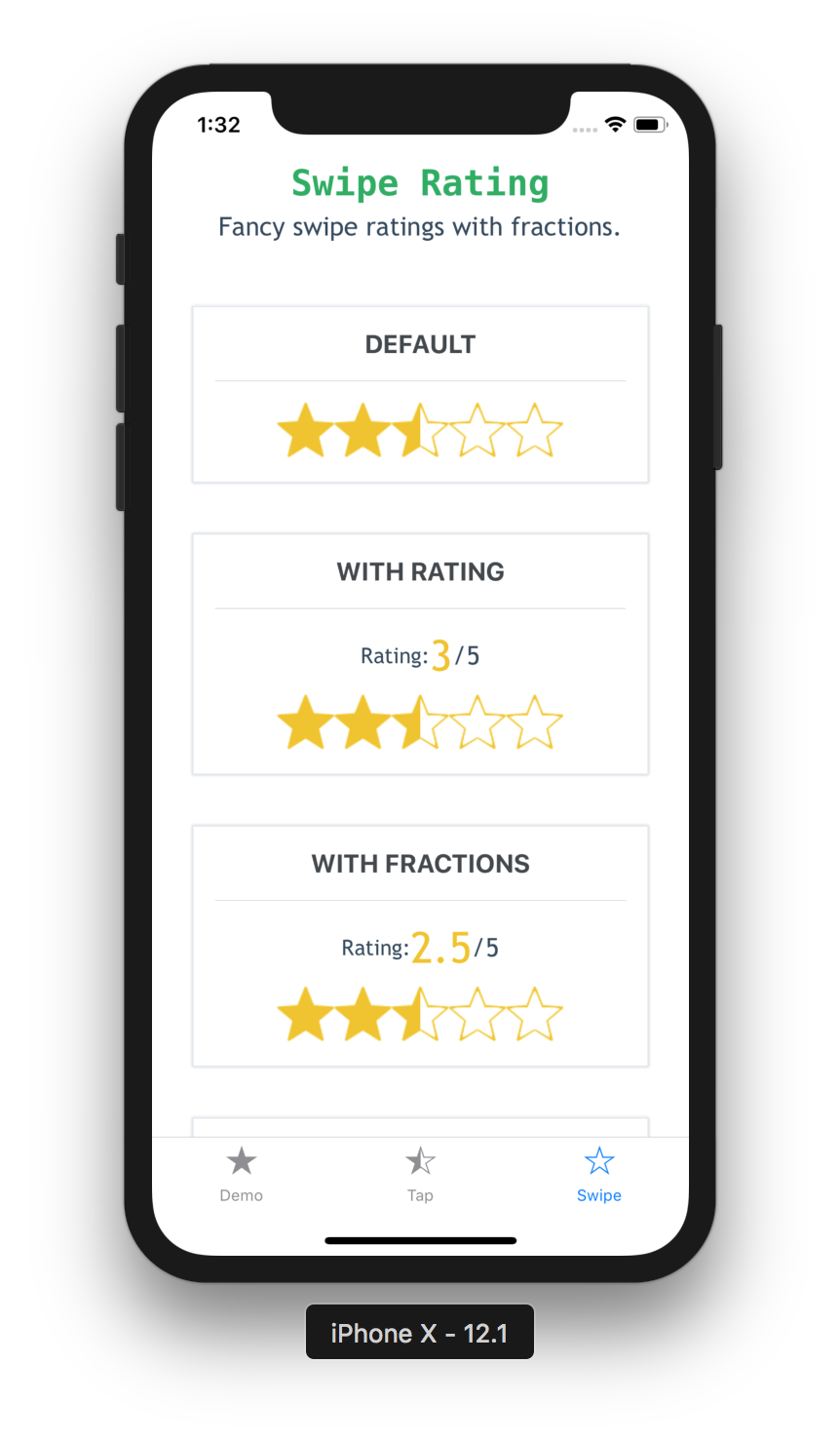
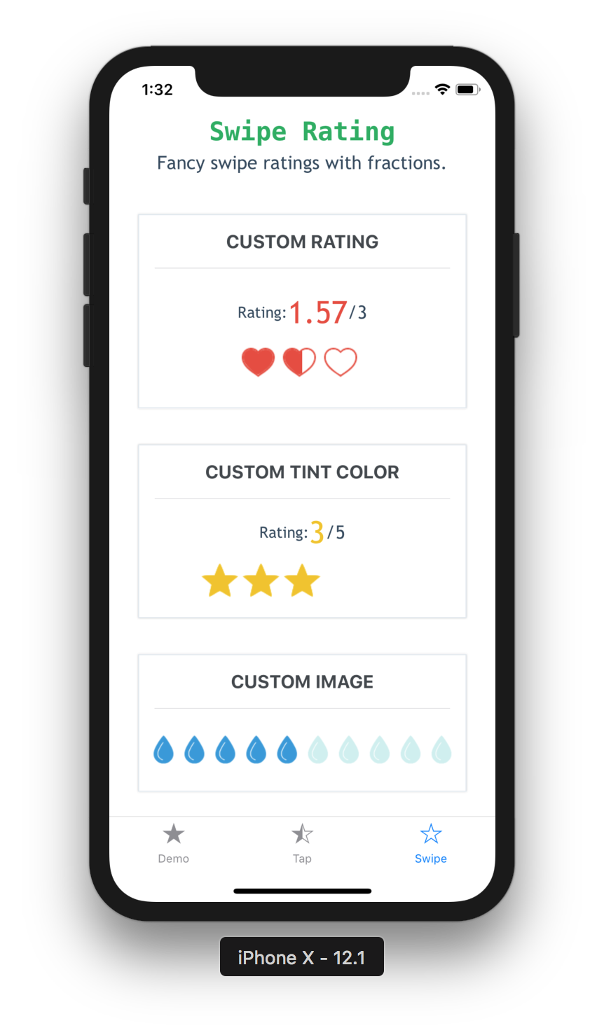
Also refer to the example app for more detailed usage example.
API
AirbnbRating
prop
default
type
description
defaultRating
3
number
Initial value for the rating
reviews
['Terrible', 'Bad', 'Okay', 'Good', 'Great']
string[]
Labels to show when each value is tapped e.g. If the first star is tapped, then value in index 0 will be used as the label
count
5
number
Total number of ratings to display
selectedColor
#f1c40f
string (color)
Pass in a custom fill-color for the rating icon
unSelectedColor
#BDC3C7
string (color)
Pass in a custom not fill-color for the rating icon
reviewColor
RatingProps
prop
default
type
description
type
star
string
Choose one of the built-in types: star, rocket, bell, heart or use type custom to render a custom image (optional)
ratingImage
star
string
Pass in a custom image source; use this along with type='custom' prop above (optional)
ratingColor
#f1c40f
string (color)
Pass in a custom fill-color for the rating icon; use this along with type='custom' prop above (optional)
ratingBackgroundColor
white
string (color)
Pass in a custom background-fill-color for the rating icon; use this along with type='custom' prop above (optional)
tintColor
Try it out
You can try it out with Expo here. Or you can also run the example app locally.
Motivation
One of my friends showed me thisStar Rating feature in Bootstrap and it looks really interesting. So I challenged myself to re-implement it in React Native.
Followed by that, for v3, I recreated the Airbnb ratings component and added it to this repo, in case others find this useful. It works out of the box and is quite functional.
Determines if to show the reviews above the rating
isDisabled
false
boolean
Whether the rating can be modiefied by the user
onFinishRating
none
function(value: number)
Callback method when the user finishes rating. Gives you the final rating value as a whole number
starContainerStyle
none
object or stylesheet
Custom styles applied to the star container
ratingContainerStyle
none
object or stylesheet
Custom styles applied to the rating container
starImage
STAR_IMAGE
string
Pass in a custom base image source (optional)
none
string
Color used to change the background of the rating icon (optional)
ratingCount
5
number
The number of rating images to display (optional)
ratingTextColor
none
string
Color used for the text labels
imageSize
50
number
The size of each rating image (optional)
showRating
none
boolean
Displays the Built-in Rating UI to show the rating value in real-time (optional)
readonly
false
boolean
Whether the rating can be modiefied by the user
startingValue
ratingCount/2
number
The initial rating to render
fractions
2
number
The number of decimal places for the rating value; must be between 0 and 20
minValue
0
number
The minimum value the user can select
style
none
style
Exposes style prop to add additonal styling to the container view (optional)
jumpValue
0
number
The value to jump when rating value changes (if jumpValue === 0.5, rating value increases/decreases like 0, 0.5, 1.0, 1.5 ...). Default is 0 (not to jump)
onStartRating
none
function(rating: number)
Callback method when the user starts rating. Gives you the start rating value as a whole number
onSwipeRating
none
function(rating: number)
Callback method when the user is swiping. Gives you the current rating value as a whole number
onFinishRating
none
function(rating: number)
Callback method when the user finishes rating. Gives you the final rating value as a whole number (required)