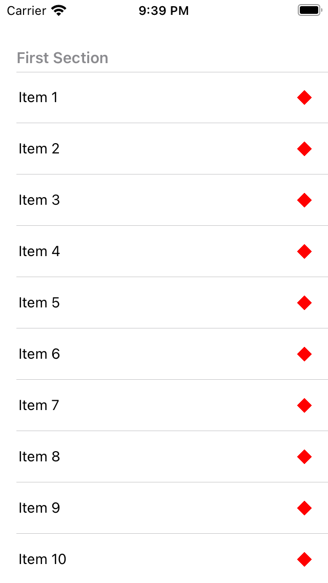
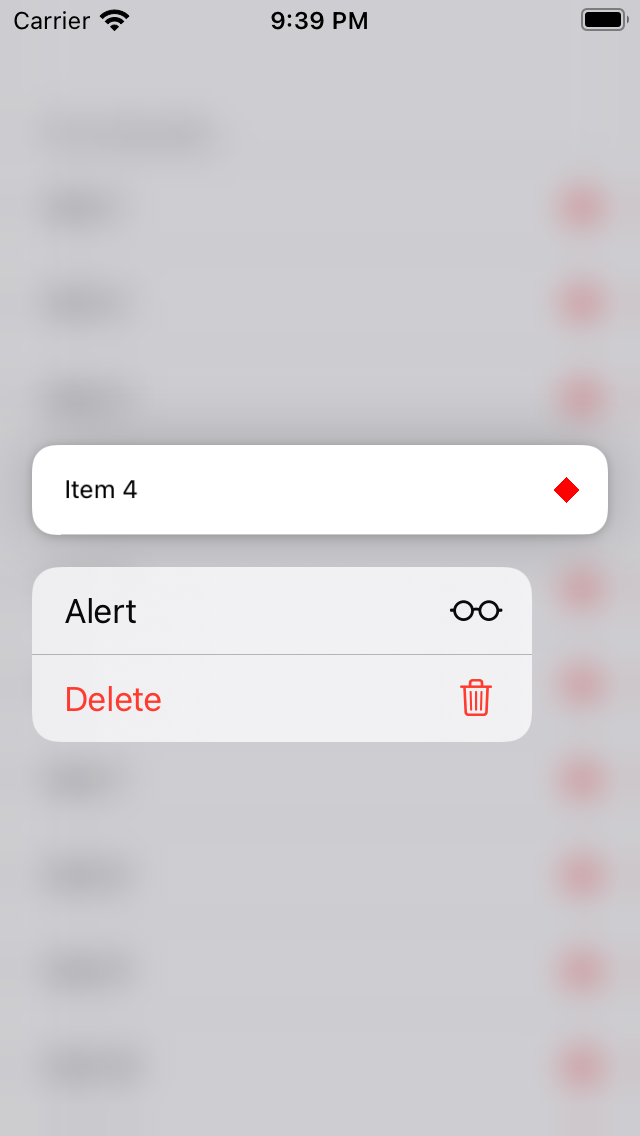
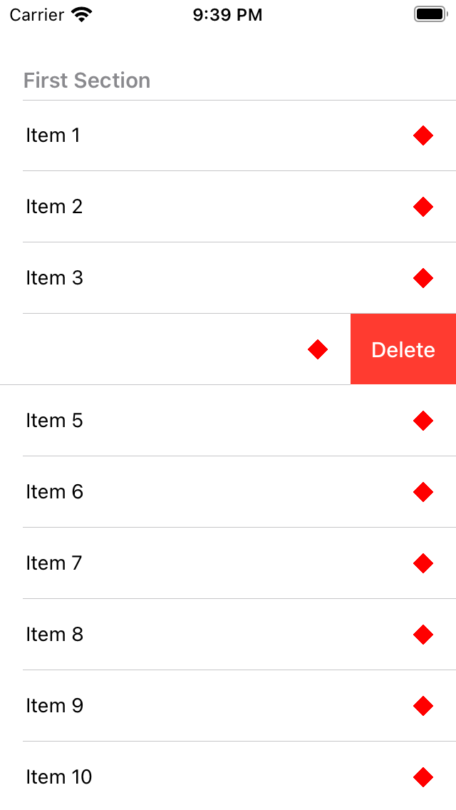
The aim is to have the fully native experience: swipe to delete (with correct haptics and automatic dismissal when scrolling), press and hold menus etc. Performance is probably on par with the default SectionList component.
Only renders custom cells - if you need the standard styles, use react-native-tableview. This library will also handle custom cells - but doing so breaks stuff like Context.
If you need a FlatList-like list, pass a single section with the title set to an empty string ('').
Props
Properties marked with an asterisk (*) are required
Name
Type
Description
sections *
Section[]
See below for props
renderItem *
({ item, index, section }) => ReactElement
Render row
keyExtractor
(Row, index, sectionIndex) => string
Needed if data does not have a key or id property
rowHeight *
number
Currently all rows must have the same, fixed height
separatorInset
{ left?: number, right?: number }
Margin applied to the left and right of each separator
separatorColor
string
Color string or PlatformColor
cellContainerStyle
style
Customise cell style: do not chagne postion, width, or height
Types
type Section<Row> = {
  title: string;
  key?: string;
  data: Row[];
  // Enables press and hold interaction
  menu?: MenuItem<Row>[];
  // Swipe actions for left-hand-side (in LTR layouts)
  leadingActions?: ActionItem<Row>[];
  // Swipe actions for right-hand-side (in LTR layouts)
  trailingActions?: ActionItem<Row>[];
  // Allows re-ordering of rows within a section
  // **MUST** be used with onMoveRow
  moveRows?: 'none' | 'within-section';
  // Used with moveRows property
  // You **MUST** update your data when this is called
Contributing
See the contributing guide to learn how to contribute to the repository and the development workflow.